Open Gate La Strada
overview
Open Gate is a non-profit organization that promotes human rights and represents the needs of high-risk people and victims of abuse, violence and human trafficking.
This was a school project that we did in teams in the last month of the Bootcamp, under the guidance of our mentor Maggie Jandova. Each team chose their research methods and presented their findings and progress every week.
The challenge
The organization’s website needs to be redesigned to better connect with its audience, provide all the relevant information to people that don’t have enough information about human trafficking and understand what they do, how they can help and why they should get involved.
design process

Research
Desk research
Studies done the by the Nielsen Norman Group have also shown that non-profit organizations generally lack specific information about their approach, mission and the detailed use of money. Other issues were usability related such as unintuitive IA, cluttered pages and confusing workflow. These aspects are very important for non-profits to build loyalty and trust.
Competitive analysis
The first step in the project was to learn more about non-profit organizations, so we did competitive analysis of similar websites like Hagar, Polaris, and I am priceless, to understand how they work and present themselves.
What they do well
- They state a clear message regarding their mission on the home page
- Showcase real stories of victims through videos or articles
- Have less CTA’s to not confuse the user
- They use strong copywriting to capture attention and engage the user
User interviews
We interviewed five possible donors from the general public. Questions like: what would motivate them into donating or how they make sure the organization is trustworthy were asked. We wanted to understand the common challenges users face and identify frustrations they experience during this process.
Findings
Would like to see a clear process of how the organization is using the donations.
Want to see stories of real victims, more pictures, videos or short documentary.
Statistics of what is the current status of human trafficking in numbers, time frame and countries.
Transparency regarding their work and how they help the people in need through their program.
Possibility of making small donations and what impact will it have on a victims’ life.
Will donate anywhere in the world where is needed if they feel connected to the story.
Usability testing
To understand how the users navigate the site and what factors influence their decision, we've arranged Zoom calls to watch the testers using the current Open Gate website, desktop and mobile. We gave them assignments and asked them to think aloud.
Findings
- The users couldn't understand from a quick look on the home page what the website was about
- The SOS number wasn't visible
- The users were confused by the mixed language (Macedonian & English) on the article pages, contact form and donation page
- Users also found it important to be able to volunteer beyond donations
- The users did not know exactly how the donations helped the victims
- They didn't understand in what activities the organization is currently involved
Building empathy
After the qualitative research, we created a persona to represent a user group of possible donors from the general public to empathize and prioritize goals according to their needs.

Identifying behaviours
We created a journey map to help us understand the course phases, the users and their overall experience.

information architecture
Organizing information
Before diving into specific design we learned how the end-user might navigate the site and what content they are expecting to see. We moved forward with building the site map. The idea behind it was that the users should have the option to read more about the subject of human trafficking, how they can help and ultimately who are the people behind this organization and what they do to help and support the victims.

ideation
Initial sketchings


final design
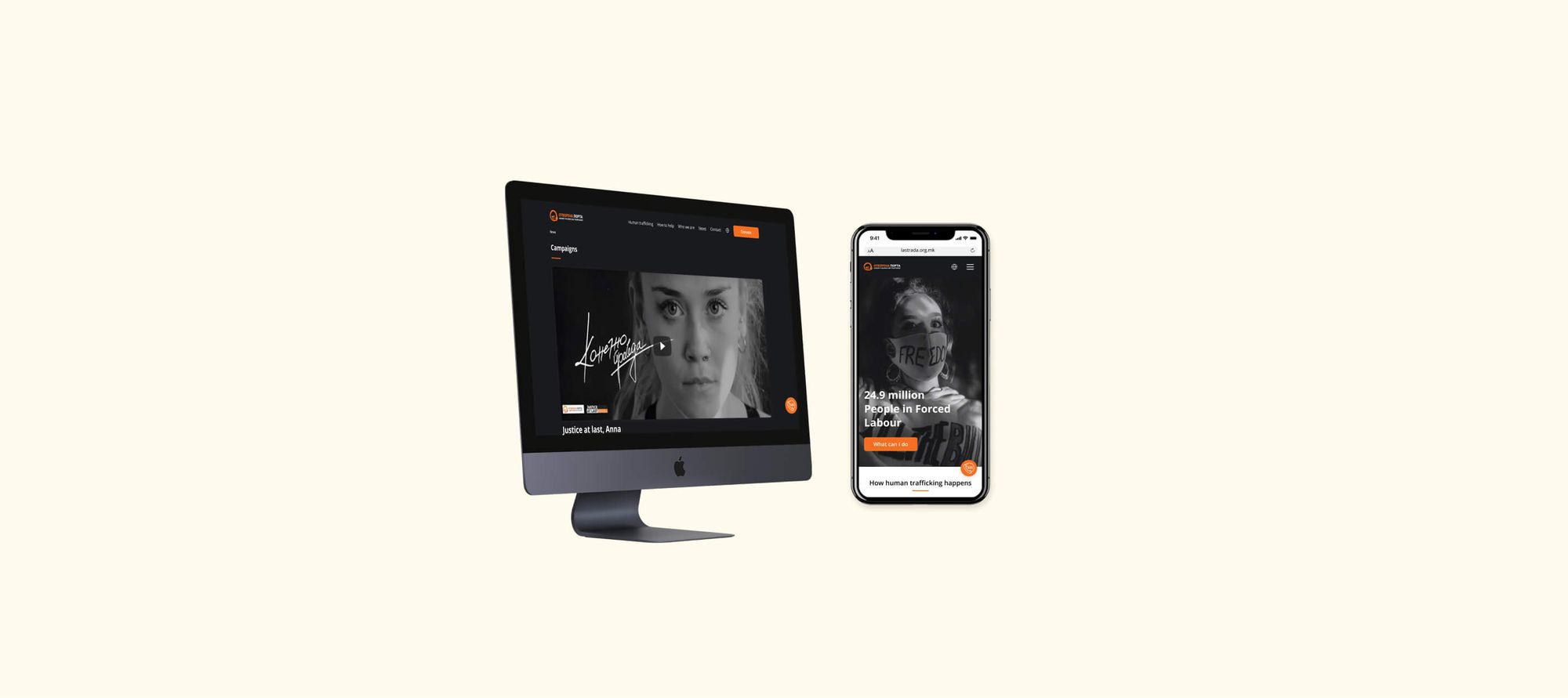
Desktop high fidelity


High-fidelity (homepage, article, news, contact, donate)
Mobile high fidelity


Usability testing
Validating ideas
The next step in our process was to measure the success of our final design. We recruited six users for this unmoderated usability study.
Findings
- In the mobile version, participants expressed frustration at not being able to find the donation button after reading the articles; they eventually found it in the hamburger menu
- Participants weren't sure of what happens next if they tap on the SOS number, would this redirect them to dial, do they copy the number and dial themselves
- Users didn't understand which nav option is selected
conclusion
Reflection and next steps
A successful website design should satisfy the needs of the users. Through our research, we learned that factors such as usability, user experience and visual accessibility are the most important characteristics in web design and not such a pretty design.
The next step would be to iterate our design based on the findings and conduct follow-up usability testing on the new website.