
Health & Fitness App
overview
Back pain. You heard of it or have experienced it at least once in your lifetime, even if your job requires you to sit at a desk, be active or on your feet all day. In fact, over 80% of people will have significant back pain at some point in life.
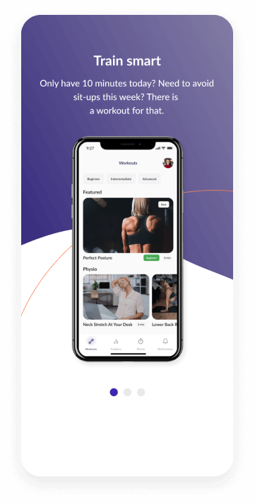
And nothing kills the spirit of fitness like an injury. Whether you’re a beginner or an exercise fanatic, an injury can throw you off your routine or set you back from reaching your goals. TrainSmart is a health and fitness app that aims to help people have an appropriate fitness routine, stay active and be injury-free.
The challenge
Identify what actions people take when they consider starting a fitness routine. Understand the end-to-end journey of how and why people choose to return and continue the program with their current physiotherapist/trainer/app, as well as the barriers encountered that prevent them from going back.
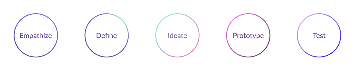
design process
Research
Competitive analysis
An audit of a few competitor’s products provided direction on gaps and opportunities to address with the TrainSmart app.
Findings
- Personalized training
- Progress history
- Community/challenges
- AI based quick workout for short durations
- Digital assessment tool
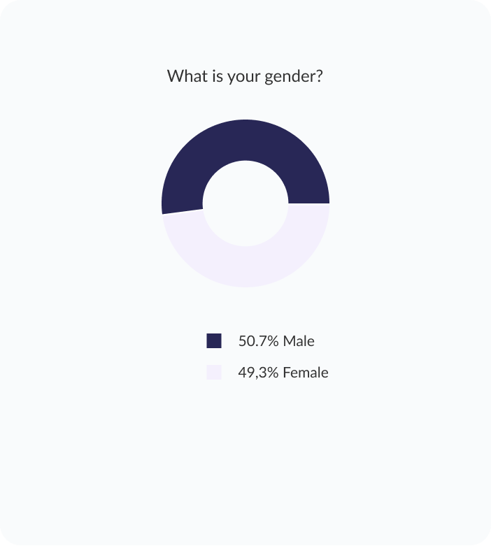
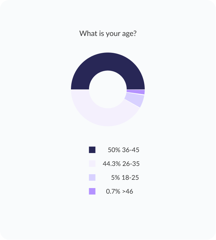
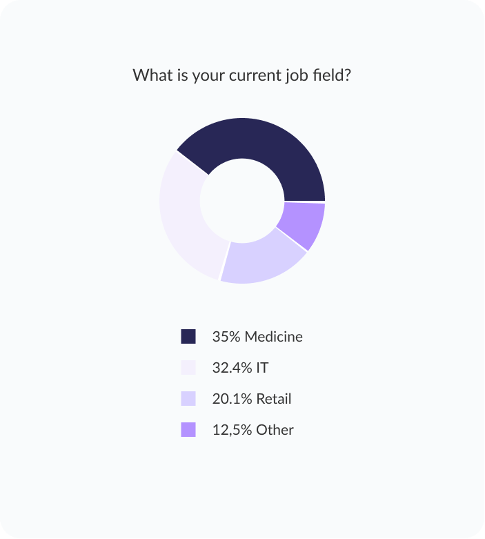
Survey
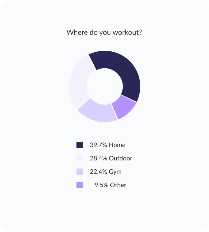
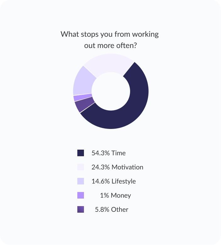
I created an online survey using a series of close-ended questions where users had to choose from predefined answers and open-ended questions. The majority of survey participants research an app before deciding to join. Over half of the respondents indicated that they would prefer an app that offers tracking progress and interactive features to keep them motivated.

User interviews
After gathering data from the survey, I interviewed five people aged 25 to 40 ( three of them have been seen by a PT at least once and, the other two haven't). I wanted to get from the users more information around the three goals I had identified earlier. My questions ranged from general ones: e.g. Why do you want to exercise?; to specific ones: e.g. What is the biggest challenge for achieving your fitness and wellness goals?, e.g. What is the one feature in your opinion every fitness app should have?.
Findings
Being healthy and staying fit is important especially during the current times.
No balance between work and personal life leaving less room for other activities.
Suffering from stress and feeling disconnected due to social distancing.
Fear of injury because the user isn’t confident in their technique.
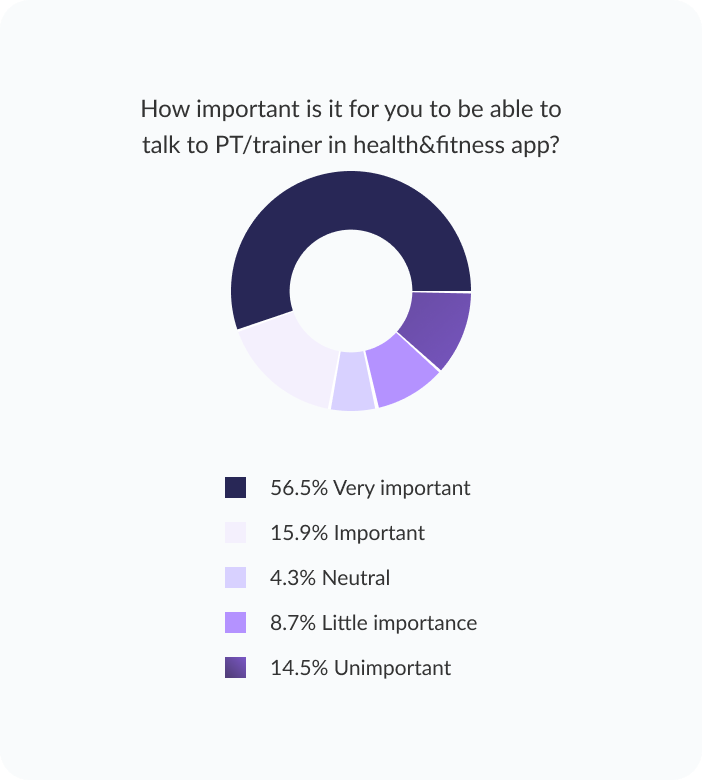
Users want the right plan based on the level activity or regular reviews from a professional .
Customization, user-friendly app and interconnectivity.
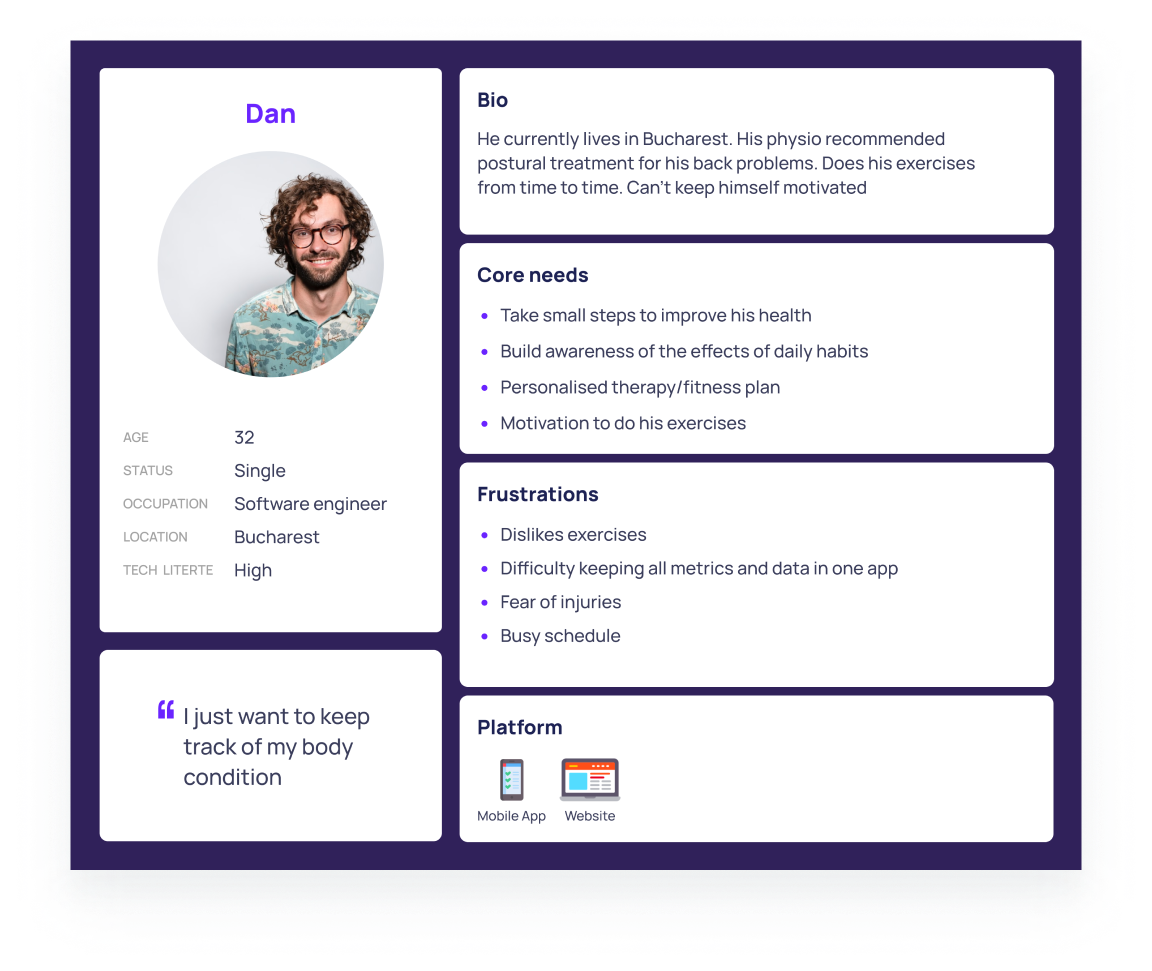
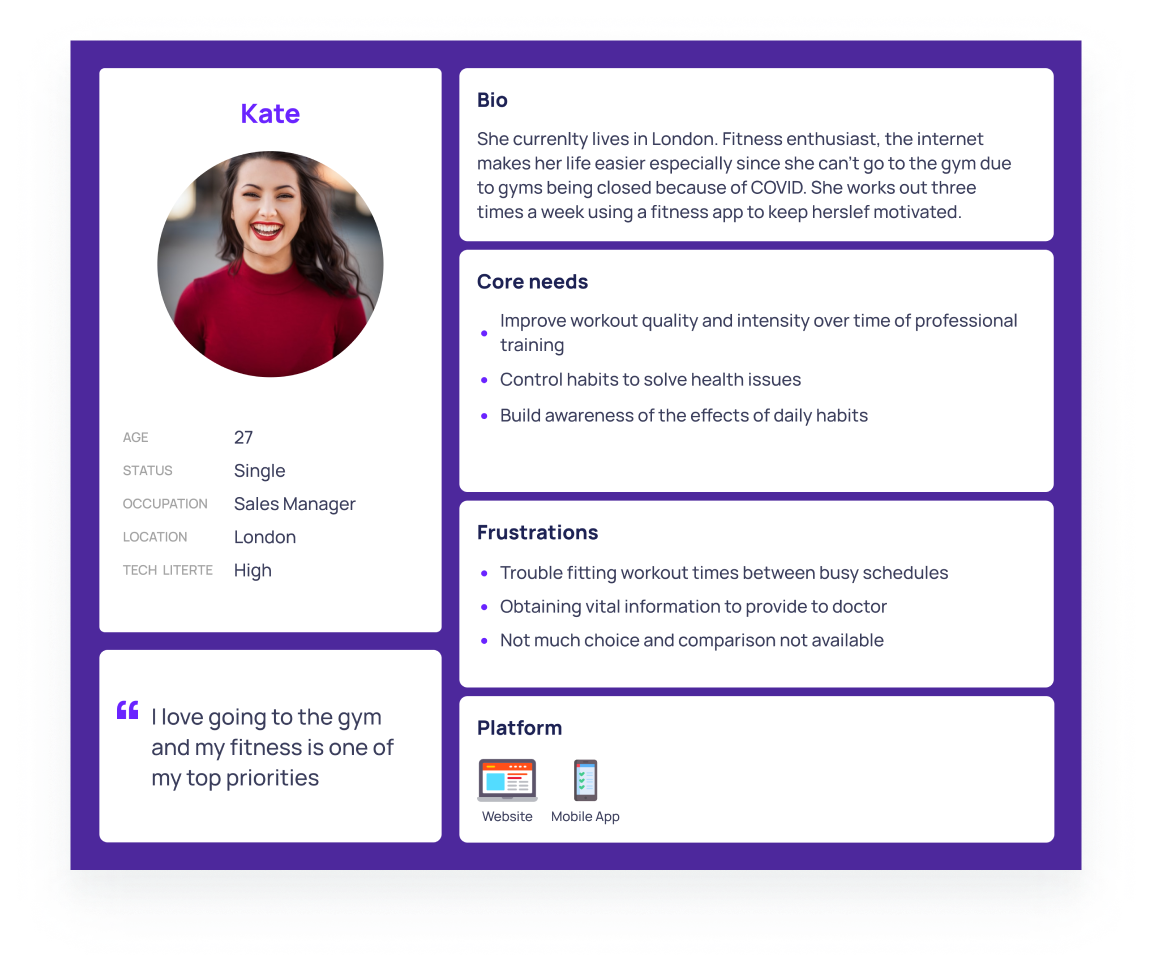
Building empathy
By conducting online surveys and user interviews, I identified three types of people with diverse needs who could be our target users.
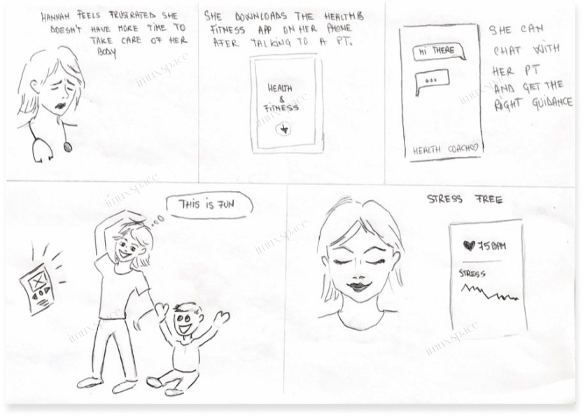
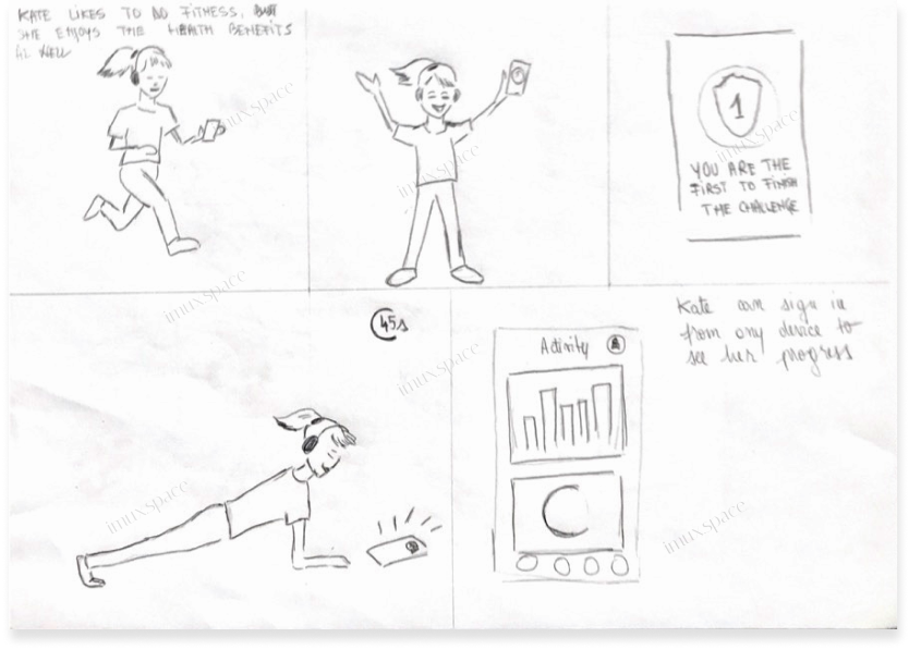
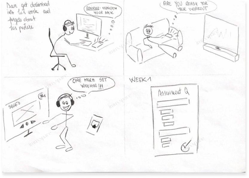
Storyboards
Identifying different scenarios
Illustrating the user's experience with storyboards helped me visualize potential solutions to problems the user might face.
information architecture
User flow diagram
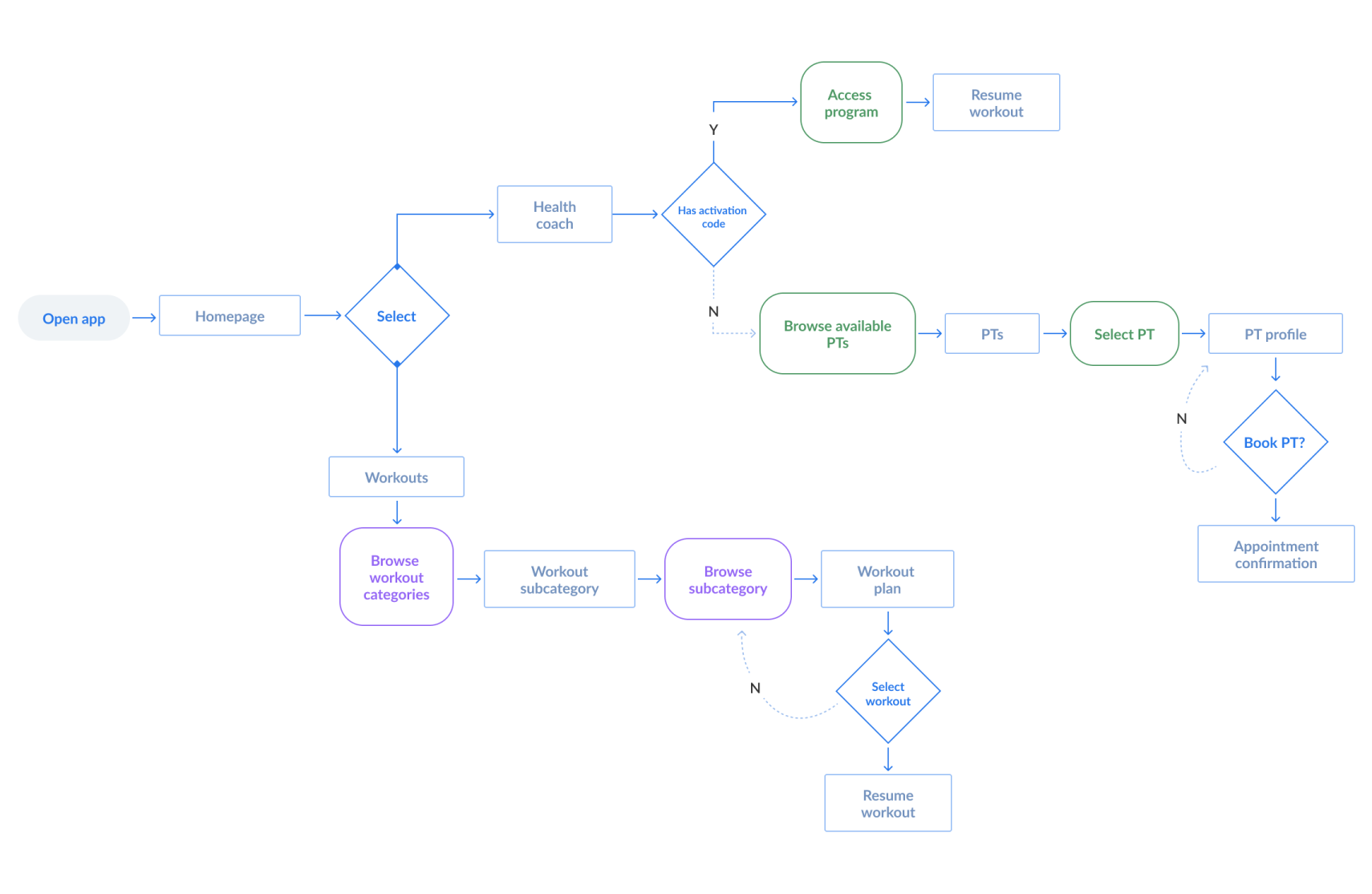
sketching
Paper wireframes
Next, I sketched out paper wireframes for each screen in my website, keeping the user pain points in mind.
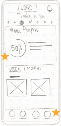
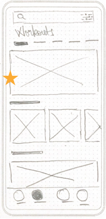
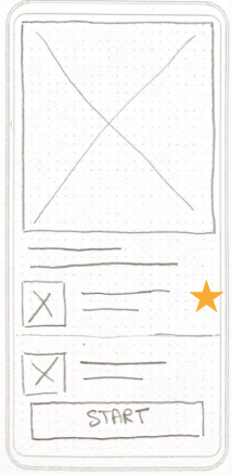
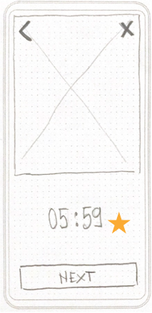
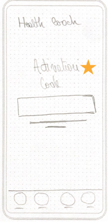
Stars placed next to the elements that made it into digital wireframes
usability test
Validating ideas
After creating the prototype from low to high-fidelity wireframes, I asked five participants to run through various scenarios in the prototype.
Findings
Users want to try out the app before registering.
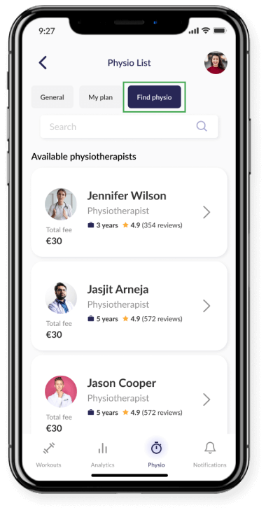
Most users had a hard time knowing what to do first to book a physiotherapist appointment.
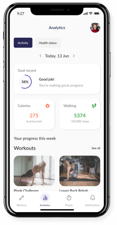
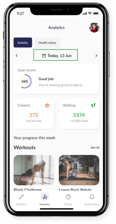
In the initial analytics, screen users could browse through other dates only by clicking next/back.
iterations & final design
Iterations after usability studies
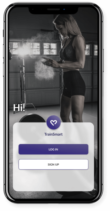
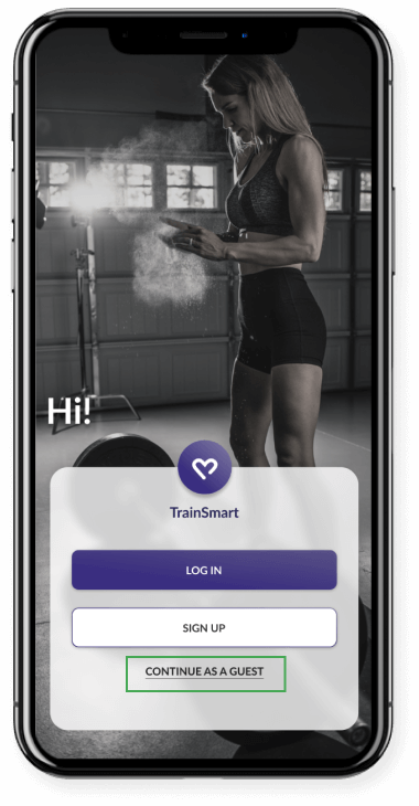
welcome page
Instead of forcing new users to input their data or immediately sign up for an account, we should give them first the chance to browse the content within the app. This way, they might be more prone to create one later. The option of “continue as a guest” allows users to try out the app before committing.
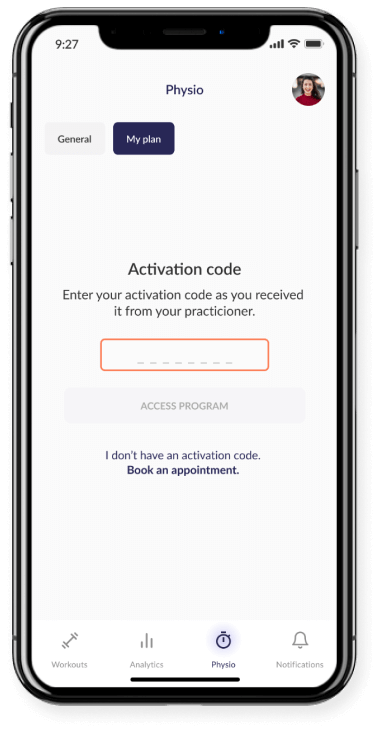
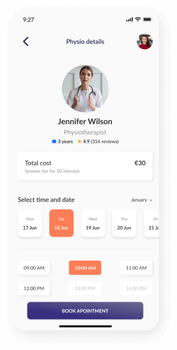
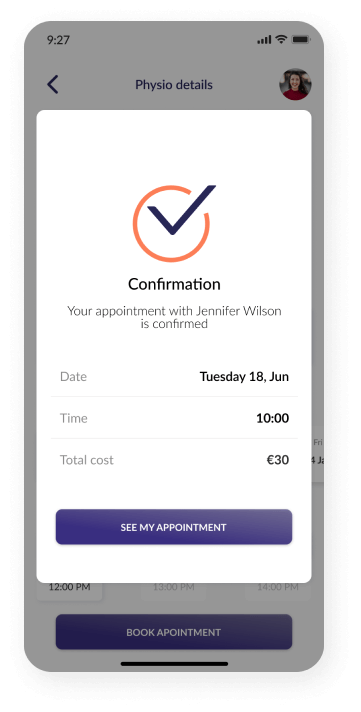
book an appointment
Based on the insights from the usability study, I made changes to improve “booking a physiotherapist” flow. One of the changes I made was adding the separate button “Find physio” rather than having it only in the “My plan” screen as a secondary button.
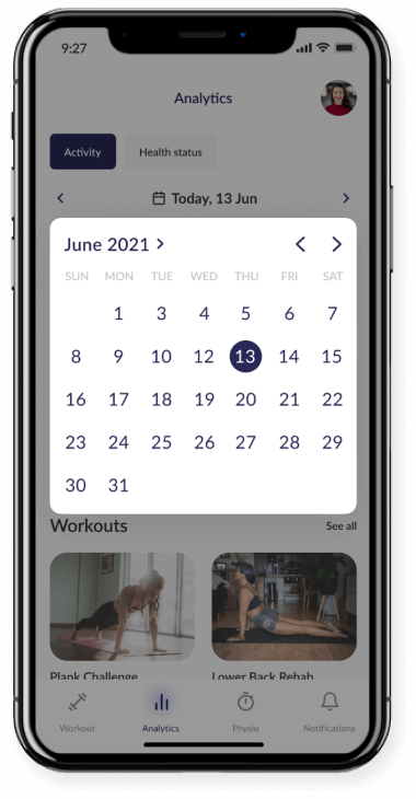
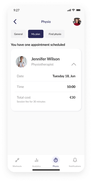
checking progress easier
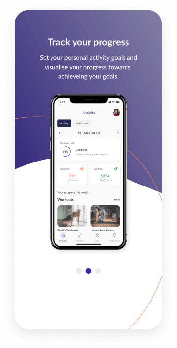
Another change I made is that I offered the user the option to check the progress easier by selecting any date on the calendar.
onboarding
book an appointment
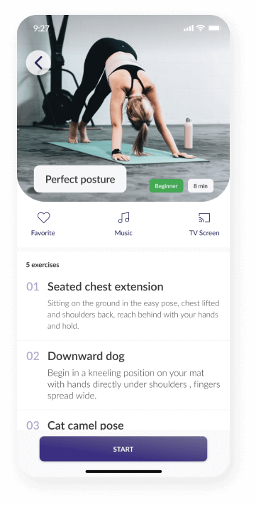
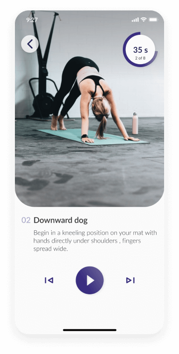
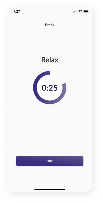
start a workout
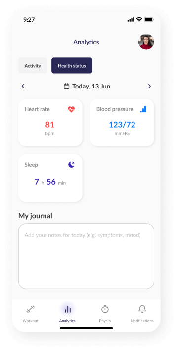
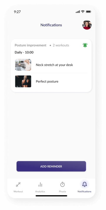
health status & notifications
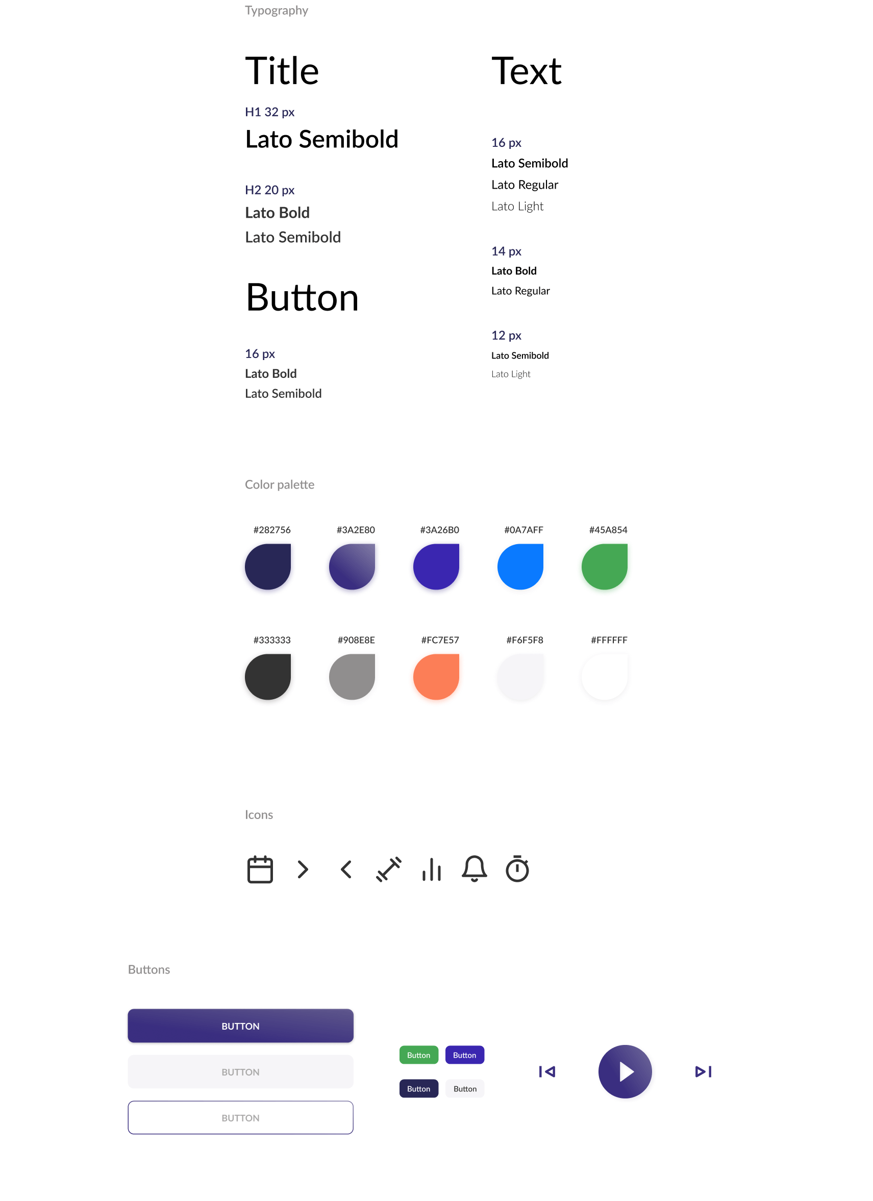
style guide
Accessibility
Accessibility considerations
- I used icons with labels and highlighted background for the selected ones to make navigation easier
- Focus for input fields to provide a clear visual notification that the focus has moved to the input field where the user has clicked on
- Used simple and clear words or phrases and added images or icons to help clarify meaning
- Used headings with different sized text for clear visual hierarchy
conclusion
Reflection and next steps
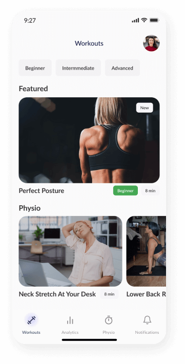
I designed an app that provides a simple yet interactive experience to boost users' engagement. The users can choose from a list of tailored exercises to their activity level or needs (optimizing results, preventing injuries, rehabilitation) or chat directly with a professional and receive a completely personalized workout program.
Users shared that the design was intuitive to navigate through and, TrainSmart makes sure they have access to essential health and fitness information.
Next steps
- Conduct another round of usability studies to validate whether the pain points users experienced have been effectively addressed
- Add more educational resources for users to learn about health and fitness tips
- Provide incentives and rewards to users for successfully completing goals